UK Savings Week ran from 21 to 27 September and deserved every bit of attention it got. But research by a challenger bank found £126 billion of small business, start-up, club and charity cash sitting in accounts paying no interest at all. A founder who closed a seed round in March is sitting on eighteen
The future of digital banking isn’t a more elaborate map. It’s removing the need to navigate at all.
Digital banking has changed enormously in twenty-five years. It left the desktop, moved into our pockets, and became something we reach for several times a day. But underneath that shift there is one thing that has stayed remarkably still: the way we actually interact with it. Open the app, scan a dashboard, tap through menus, complete a form, and execute a transaction. The screen got smaller and the access got easier, yet the model is the same one we used in a browser two decades ago. It is built around navigation, and it still asks the customer to be the project manager of their own financial admin, knowing what they want, knowing where the bank has filed it, and translating their goal into the institution’s internal language before anything actually happens.
The largest banks have responded by adding more: more features, more menus, more tabs. That path was never realistic for smaller UK banks, building societies, credit unions and specialist lenders. Increasingly, it looks like the wrong path for everyone.
The future of digital banking isn’t a more elaborate map. It’s removing the need to navigate at all.
The app fatigue wall
Every product roadmap eventually hits the same wall. Each new capability needs somewhere to live, so it gets a screen, a menu entry, a slot in the information architecture. Do that for a decade and the app becomes a filing cabinet the customer must learn (and re-learn when it changes).
The cost of that friction is measurable, and it is not small:
- Around a third of consumers have left a financial service provider over a poor digital experience, according to industry UX research published in 2026.
- More than 60% of users abandon digital account-opening flows that are poorly designed, with each unnecessary field or unclear step adding a reason to quit.
- Capgemini found 47% of prospective customers abandon digital onboarding mid-process, with limited automation the primary culprit.
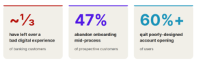 Digital friction is real, large, and a direct drain on acquisition.
Adding features has made digital banking more complex. Complexity is exactly what smaller institutions can least afford to carry.
This hits smaller financial institutions harder than it hits the giants. A specialist lender or automotive finance provider might offer genuinely sophisticated products, but have to deliver them through a front-end constrained by a legacy core and a small, heavily contested budget. A building society or credit union runs on relationship and membership, yet its app (if they even have one) often forces the same cold menu-hunting as any high-street bank. The gap between the quality of the service and the friction of reaching it just keeps widening.
The paradigm shift: from where things live to how fast you arrive
An intent-driven interface replaces the menu-driven model with something responsive and outcome-oriented. Instead of asking the customer to learn where functionality lives, the interface builds the workflow in real time around what the person is trying to achieve.
Traditional design optimises where things are placed. Intent-driven design optimises how fast a customer reaches their outcome.
The unit of design stops being the screen and becomes the goal. A few ideas make this work in practice:
- Natural language and multimodal inputs let customers say what they need in human terms, typed or spoken or picked from context chips, rather than translating it into jargon like “internal transfer from Account A to Account B.”
- Just-in-time interfaces render only the controls and confirmation steps a given action requires, instead of parking every feature on a permanent screen.
- A predictive context engine reads signals like time of month, recent behaviour and known commitments to anticipate intent, surfacing a ready-made action card before the customer starts typing.
- Transparent confirmation loops pair every high-stakes action with a clear card spelling out what will happen, what it costs, and an explicit trigger to proceed.
The difference is easiest to feel in an example. Today, moving money for an upcoming trip means checking your balance, finding the transfer screen, selecting two accounts, entering an amount, confirming. In an intent-driven experience the customer says, “set aside £200 for next week’s travel” and the interface assembles the rest.
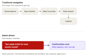
The same outcome reached two ways: a five-step chain versus a single resolved request.
Trust has to be built in
Most experienced banking leaders will feel a healthy tension at this point. Natural language and predictive engines carry real risk: misinterpretation, opacity, a customer being nudged toward something they didn’t fully understand. Under Consumer Duty, with an FCA that expects demonstrable good outcomes and clear explainability, “the model decided” is not an answer.
The regulator has been explicit that this is a board-level responsibility. In its Dear CEO letter to retail banks and building societies, the FCA said it expects the Duty to be a personal priority for senior leaders, with good customer outcomes embedded into strategy and culture. Its more recent work on digital design makes the same point from the other direction: when design is used well, it can genuinely support good outcomes, but the same techniques can just as easily harm them.
Handled deliberately, an intent-driven interface is a Consumer Duty enabler, not a Consumer Duty risk.
That is precisely why the confirmation loop sits at the centre of this model rather than at its edge. The system can build the workflow instantly, but the customer still sees a plain-language summary of what is about to happen, what it costs and what the alternatives are, and nothing executes until they say so. An intent-driven interface can be more transparent than today’s forms, because it states the outcome in human terms instead of burying it in fields and toggles.
This plays out differently across the sector:
- For a bank, the pressure comes from both directions at once: large incumbents outspending on features above, and neobanks setting the bar for simplicity below. Intent-driven design is a way to compete on experience without trying to out-spend either, letting a smaller change budget go further by organising the app around what customers want to do rather than everything the bank could theoretically offer.
- For a credit union or building society, the relationship model is an asset. An interface that understands member intent and explains itself clearly reinforces the trust these institutions already trade on.
- For a specialist or automotive lender, where affordability, forbearance and vulnerability are constant considerations, an intent-driven layer can surface the right support option, whether a payment holiday or a hardship pathway, at the moment of need, with a clear record of what was offered and agreed.
The FCA’s own vulnerability work underlines why this matters: it found that customers suffered poor outcomes when firms failed to communicate in a timely way, particularly when circumstances created urgency, such as needing to pay a bill. Meeting intent at the moment of need is exactly the capability that addresses that.
What the customer feels
Take away the navigational friction and the relationship changes. Banking stops being a chore the customer performs and becomes a capability sitting inside their day. They don’t “use the app” so much as express a need and have it met.
This is not a fringe expectation. Forrester found that 68% of UK online adults already believe they should be able to accomplish any financial task through a mobile app, and with 75% of UK adults now using mobile banking, the app is the relationship for most customers. For institutions whose whole proposition rests on being closer and more human than the big banks, meeting that expectation isn’t a cosmetic upgrade. It’s the digital version of the thing they already claim to be, and for a lot of them it’s the first time the app has reflected it.
The strategic question for product leaders
One caveat matters. None of this requires ripping out the core, and it shouldn’t be pitched internally as if it does. The real prerequisite is architectural discipline: starting to decouple the front-end experience from hard-coded screen flows, and building toward modular, component-based design systems where the UI can be assembled around intent instead of pre-drawn around features. That’s an incremental journey, and it suits institutions used to doing a lot with focused resources.
So, the strategic question isn’t whether intent-driven banking arrives. Customer expectations set everywhere else in their digital lives make that inevitable. The question is whether smaller and specialist institutions treat it as a chance to leapfrog, using their relationship advantage and their distance from big-bank legacy politics to move first.
That’s a conversation worth having properly. If you’re weighing what an intent-driven experience could mean for your customers, your roadmap and your architecture, we’d be glad to get into it. Start the conversation with us.